Sunday, May 11, 2014

Marsolais Menu Co.


On May 7th, the Society of Printers enjoyed its final meeting of the 2013/14 season. As secretary of the Society, I took on the unenumerated responsibility of supplying letterpress printed menus for each of the 8 dinner meetings, which occur on the first Wednesday of every month from October to May. It all makes for a gratifying pile, and as an avid collector of ephemera I am my own most reliable supplier.

But I only intended to print a menu for the October meeting, the occasion being the Charlie Rheault Lecture delivered by Simon Loxley, a British graphic designer, historian and author of Type: The Secret History of Letters and Printer's Devil: The Life and Work of Frederic Warde.

As the contact person for Simon's visit to Boston, I was determined to help show him a good time. This meant printing the invitation for his talk (with a huge assist from my friend Darrell Hyder at the Sun Hill Press) and a menu as a keepsake. For the invitation Darrell kindly allowed me the use of his Centaur and Arrighi types, and also access to his Heidelberg Windmill. But for the menu I had to use my own type, which immediately presented a problem: I didn't have very much of any one face. And very little at that of text faces below 18 point. I looked over my 3 cabinets rather doubtfully. A little 18-pt Bembo roman and 12-pt italic, and enough 14-pt italic in an old forme to set a single line; a case of 12- and 14-pt Romulus small caps; and 42-pt Augustea Inline for display. This situation was something of a burlesque of the usual inescapable battery of limitations faced by the hot-metal printer. But as a friend of mine likes to say, what cannot be helped must be endured. And I say, when you volunteer you can't complain.


I went with a tri-fold format to save some time, though the decision to use a second color pretty much nullified the savings. But Simon, and my SP colleagues, seemed to appreciate the gesture, and so all the anxiety of designing something classy with a handful of spare parts gave way to a feeling of accomplishment that sweetened an already memorable evening. I retired as the SP's menu printer on a high.

But the fact remained that I was desperately in need of type. As October progressed, the intervals between commissions allowed for more frequent visits to Sun Hill Press in North Brookfield. Darrell has an English Monotype Composition caster that has served him well over his 40-year career as, in me 'umble opinion, New England's finest country printer over that same span of time. Knowing that I had been trained to run a Monotype machine under John Kristensen at Firefly Press, Darrell kindly offered to let me cast usable quantities of type from his impressive collection of matrices whenever our schedules aligned.

Since I already had a case of 18-pt roman, the first typeface I chose to cast was Fournier, a charming, mellow and ornament-friendly 1924 revival of the 18th-century French original. Darrell had a 14-pt mold on the machine from his last job requiring composition, so I started there. It had been over a year since I had left Firefly, so my Monotype instincts were a little rusty. But after an hour or so of tinkering, the machine began producing beautiful shining rows of fresh type. Soon I had full fonts of roman, italic and small caps ready to lay into cases.


Fournier is a face I've admired from afar (mostly in Darrell's work), but had never used for any of my own projects, as it was one of the few historical revivals not in Firefly's awesome collection of book faces. Between business cards for a woodworker and a promotional piece for my shop, the type was in a comp stick just as quickly as it hit the case.


When the November SP meeting rolled around, Fournier Brain was at full froth. I came out of retirement to produce a menu that if nothing else would serve as another specimen of the type I could use to show prospective clients. The lima beans and red cabbage in the entree served as inspiration for ink colors.


Maybe I would have done it differently if I'd had a wider range of sizes, but even so this a much more organic design experience than the Frankenstein job turned in for October's meeting.

As December arrived I began thinking about a Christmas keepsake for family and friends. I had just acquired two small cases of type ornament and was eager to experiment. It occurred to me that the corner pieces of various separate but related designs might be persuaded to nest comfortably within a compound arrangement. The fact that I had only four sorts for each corner piece did not deter me from going forward. They were a bit worn, but as they were foundry-cast I knew they could handle a few more kiss impressions.


To the case of Fournier! Why not, as surely my last printed menu, do something a little nice for my fellow SP members for the holiday meeting? I went back to the tri-fold but with a twist, allowing for two panels each featuring a Christmas ornament with the initials of the Society and those of our host, the Club of Odd Volumes. Long after the meal has been digested, the design still satisfies.


It was becoming clear that I had committed myself to a printing program and that though I had no stated objectives to complete the set, once the Monday before the meeting rolled around I knew I would find myself with comp stick in hand trying to set a new speed record for design and production (the record is 5 hours. See: March). But let's at least give Fournier a break!

It happened that later in December I visited John Barrett's Letterpress Things, an awesome warehouse of salvaged printing equipment in Chicopee, Mass. He had recently bought the type holdings of Yale's Greer Allen, a connoisseur of stylish European foundry type. I was amazed to find that John had quite a bit of Weiss in various sizes still available for sale. I've had a borderline irrational love of Weiss for years, though I never seriously thought I would be able to obtain it, such is its rarity and the low voltage of my purchasing power. But the delivery of a few carving jobs allowed me to stand tall and take into the shop Allen's Weiss and, huzzah!, his 12- and 14-pt Romulus roman and italic to go with my case of small caps. I was pretty sure I knew what type I'd be using for January's menu. The prudent printer would have chosen either Weiss or Romulus. I chose both!


Perhaps not natural bedfellows, I grant. The two faces reflect much of the personalities of the designers, Weiss a full-blooded Teuton, Van Krimpen the dead-serious Dutchman. I'm still not quite sure I pulled this off, but it was fun while it lasted.

February saw Fournier's inevitable, triumphant return with a design that ratcheted up the complexity factor through too-clever-by-half ornamentation and a fussy fold. There was only one problem: thanks to a huge blizzard the SP meeting was canceled. Perhaps it's just as well that this menu saw only limited release amongst close friends and a few fellow printers. If you're going to swing for the fences, you better hit it out of the park. The fact that not everyone got the typographic joke could be taken as a sign that it was a ground-rule double at best. I'll give you a hint: the entree was salmon.


I thought it would be fun to make it look like the salmon was swimming upstream, achieved by careful placement of the lower ornaments so that they were half-revealed by the fold. The 12-pt Bell italic lowercase "p" gave the salmon just the right look of flinty determination, and the addition of the morticed ornament for a lower jaw was a touch of verisimilitude and the clue, I thought, that gave it away. Can't win 'em all, I s'pose.

Fortunately March brought better weather and an opportunity to practice some restraint. What better way to keep things simple than to allow yourself five hours to design, typeset and print the job. The speaker, Jesse Ragan, was giving a talk about his experience digitizing the experimental type designs of Rudolph Ruzicka. It seemed appropriate that the menu be set in his Fairfield with the accompanying ornaments, which meant a drive into Firefly the morning of the SP meeting for a rendezvous with the Linotype. This machine and I have always gotten along reasonably well. During my apprenticeship with John it was the first piece of typecasting equipment to which I was introduced, and though I had my fair share of molten lead eruptions and frustrating setbacks, I always had the sense that the machine really did want to work properly, really. But I was worried that I had been away from the literal hot seat for too long, that I'd run out of time before I even finished casting the type. Actually, it was just like riding an enormous dangerous bicycle without any wheels.The trickiest part was overcoming the false start with the ornamental design. Instead I inadvertently created an optical illusion, setting the rectangular ornaments in a pinwheel fashion that look as though they're about to spin away from each other. The cool baby blue was a nod to Ruzicka's springy pastelle palette.


By the end of March I had acquired various sizes of Perpetua, Joanna and the 48-pt Gill Floriate, and so the April menu practically set itself. As a lettercarver I think I'm required by law to love Eric Gill's lettering and type design, and I do, though my appreciation of the man is, ah, what's the word, complicated. He once said, "In inscription-carving, while we may remember Trajan lovingly in the museum, we must forget all about him in the workshop." I feel the same way about Gill. Modern biographies of the man have turned his admirers into apologists. But never mind. For the menu I decided to accentuate Joanna's lovely narrowness with a skinny format, and something suitably inscriptional on the cover.


I was delighted by how nicely the border played with the Floriate, which is so freakish that, true story, I once passed on a chance to acquire it from Stinehour Press during a type sale because it was too silly. I'm very glad the days of not-having-it are over. My eyesight is a little keener now.

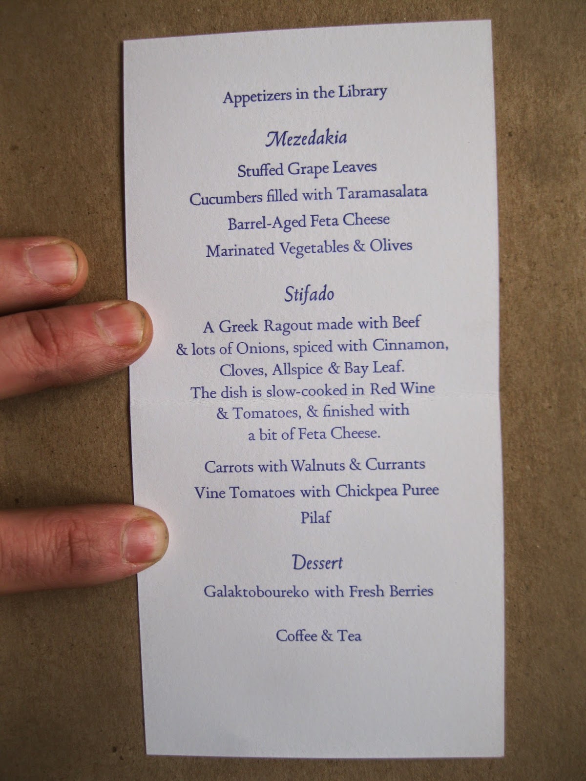
And then we came to May. The End. Well, almost. The story is the same but the type is . . . very different. Remember when I raved about Greer Allen's taste in type? Back in the 1960s he acquired four sizes of Rudolf Koch's Jessenschrift from the son of Joe Graves (Gravesend Press), a protege of Victor Hammer, who was himself a friend and protege of, wait for it, Rudolf Koch. I had seen the type at John Barrett's during three consecutive visits, increasingly amazed that no one had scooped it up. Though I didn't have any immediate need for it, there was a very great want and just enough room in the budget to take home this historic type, incidentally the only face that literally has my name on it. As is my established practice, as soon as I bring type into the shop I have to use it, if only to have a specimen handy. Enter: May's menu.


Embellished with an anonymous cut of rogues engaging in louche behavior, the last menu of the season also features, for the first time, something of a colophon, which was basically just an excuse to use the "Printed in USA" ornament. But it was also a personalized wink to the SP archives, which is now thickened somewhat by a year's worth of one printer's donated dinner ephemera. Now that the set is complete, I can officially definitely retire. Maybe.


Monday, August 12, 2013

Fair Play


Two weeks ago I was fortunate enough to participate as a featured demonstrator at the 2013 Lowell Folk Festival. It was a homecoming of sorts, as in 2011 I was there as a letterpress printer with John Kristensen of Firefly Press, where I worked as an apprentice for six years. As we were breaking down our booth a woman kindly came over to give us a hand. I was then in the first blush of my new passion for lettering in stone and it wasn't long into our conversation that I began raving about it. Somewhat naively I thought at the time, she said matter of factly, "You should study with Nick Benson at the John Stevens Shop." That's sort of like admitting that you like baseball and someone saying you should go play for the Red Sox. I mean, do I just show up at Fenway with a bat and glove and wait for John Farrell to put me in the lineup? Or rather, show up at the JSS with a mallet and chisel and be put to work? Surely it wasn't that simple. But this woman turned out to be Lynne Williamson, director of the Connecticut Cultural Heritage Arts Program at the Institute for Community Research. One of her organization's primary purposes is to facilitate mentor/apprentice relationships between traditional craftspeople from across state lines, the states being Massachusetts, Connecticut and Rhode Island. Long story short (see: sixweeksjss.blogspot.com), Lynne made it possible for me to study with Nick Benson in the spring of 2012, and now here I was back at the Lowell Folk Festival demonstrating as a lettercarver. I am a government-funded success story!


What a happy coincidence that the theme for this year's festival was Carving Traditions. I shared a tent with Nick Longborg, a woodcarver from Halifax, MA, who specializes in signage and decorative sculpture. We were joined amiably by Wen-Hao Tien. She is a visual artist based in Newton, MA, with an impressive multimedia portfolio that includes traditional Chinese seal carving, such as you would find authenticating a work of calligraphy or a watercolor painting. Over two days we enjoyed a steady stream of curious onlookers and reveled in the general good-feeling of being among other carvers. Given the solitary nature of the work, it was stimulating to be out in the world sharing the craft. In response to people who approached the demonstration apologetically, I liked to say that lettercarving occupies the eyes and the hands, leaving the mouth with nothing to do but answer questions.

My new press sign made its first appearance in public.


By the end of the weekend I had collected over forty email addresses from visitors wishing to stay in touch, a gratifying haul indeed. While I wasn't able to finish my "Festina Lente" demo, I still felt like I accomplished my main goal, which was to create a little room in people's imaginations for considering the ancient history of lettering in stone and its various modern applications. Make haste slowly:


A week later this happened:


A week after that I was back in demonstration mode, honeymooning at the Bolton Fair. I was invited to attend by Phil Wilson of the nascent Lost Arts Collaborative (www.flintlock-farm.com), who was recommended to me by my friend and longtime supporter, folklorist Maggie Holtzberg. I grew up in Hudson, the next town over from Bolton, but since it has always coincided with the Sterling Fair, the fair of my youth, this was my first visit to the Bolton Fair (technically now in Lancaster). At any rate, it was a much-desired opportunity to share my work with a gathering of extended neighbors and the experience did not disappoint. I even ran into my first boss, now a part-time blacksmith, from the hardware store in Hudson where I serviced lawnmowers and filled propane tanks as a restless teenager. The setup:


I was able to put one of our wedding presents to immediate use, a personalized portable flat file (thanks, Joe and Rachael!) which kept my ephemera display safe from the gusting winds.


In one visitor's 'umble opinion, I needed a flashy sign on my tent to attract attention and differentiate myself from the crowd. Fortunately I was the only lettercarver there and the novelty of a man pounding on a piece of slate proved compelling enough to the dozens of visitors who stopped, watched and took a business card. One of the challenges I face in trying to establish my business is that while in central Massachusetts I have little competition as a letterpress printer and none as a lettercarver, there is a correspondingly narrow market for my services. That is, until people see the work and start getting ideas. Suddenly that unique wedding present someone was trying to find began to look a lot like lettering in a piece of slate. Or it occurred to a family that the only thing missing from their new stone walkway was their name. A lot of people inquired about putting their names or address numbers on a piece of stone already on their property. This is the part where I wish I had more experience, that is to say any experience, carving letters in granite. That day will come soon I have no doubt, but until then I have to persuade customers that slate is great.


It was the most frequently asked question of the weekend: what is that? Having finished "Festina Lente" on Saturday, I devoted Sunday to answering that question with a playful demo sketched freehand directly onto the stone. I ordered this sample from a quarry with the main specification that it be as dark a green as possible and blemish-free. As green goes it missed the mark, but more alarmingly the exclamation point of dark matter embedded in the stone did not inspire confidence. It would make a great countertop or a classy backsplash for a sink, but for my purposes it was a chisel-breaker to be avoided at all costs. So I promptly drew right over it. How hard could it be, really? It is extremely hard. I carved at a letter-per-hour rate that would get me laughed out of the John Stevens Shop for sure (to say nothing of the, ahem, decidedly English style of the lettering). But again, production mode was not the goal or the point. I was able to score another forty email addresses in my notebook and judged my success on the display of enthusiasm folks kindly showed the process and the work. My sincere thanks to all the good people who visited, struck up a conversation and made the weekend such a pleasure. Thanks also to my beautiful wife, Meg, for pretending she was on a beach in Hawaii.


Tuesday, April 16, 2013

Stephen Harvard Memorial Lecture

Since I joined Facebook in January I've rather let the blog go to seed. In with carefully chosen photographs and pithy captions, out with carefully chosen photographs and dilatory ruminations. I'm returning now to this format, however, because last Thursday was, if this is even possible, Too Awesome for Facebook. The occasion was the Stephen Harvard Memorial Lecture at Dartmouth College, this year delivered by David Godine on the subject of The Stinehour Press.


A word about Stephen Harvard then a word about The Stinehour Press. Stephen Harvard was a prolific, visionary type designer, calligrapher, lettercarver and illustrator, etc., whose work spanned centuries and various technologies in pursuit of ideal alphabets. He graduated from Dartmouth in 1970 and until his tragic death in 1988 he epitomized the trailblazing spirit of the Bridge Person, a term he coined to denote those who enrich themselves with a thorough understanding of the tradition and tools of their trade and seek to infuse new technologies, in his case the computer and the digital types he designed for Adobe, with ancient principles. I'm not qualified to judge how successfully he crossed that bridge because I've pitched my tent on the side of the river strewn with hand tools and metal type. I have no love for the computer. But I have always admired the scope of his program and, as one of the few moderns equally dexterous with a comp stick, broad-edged brush, and a mallet and chisel, he continues to be an inspirational figure to me.

At the time of his death, Stephen Harvard was Vice-President of The Stinehour Press, founded in the early fifties by another Dartmouth alum, Roderick Stinehour. For over fifty years a distinguished printer of books and ephemera in the Northeast Kingdom of Vermont, The Stinehour Press has long been the benevolent paterfamilias at the head of the New England book arts' dinner table. Stinehour inherited a typographic legacy burnished in the first half of the 20th century by printers like D. B. Updike, Bruce Rogers and Fred Anthoensen, and thus refracted that influence to many smaller outfits and individuals who made it their own and then passed it on. I consider myself very lucky indeed to have cultivated friendships with many people involved with Stinehour, including Rocky himself, through my six-year association with John Kristensen at Firefly Press. Thus the event at Darmouth was much more than a retrospective of the life's work of one man, though in substance it certainly was that. More accurately, it was a family reunion. For the Stinehours this was literally true.
 

People from all over New England and beyond descended upon the Baker-Berry Library for an afternoon of repaying in full the promise delineated in The Stinehour Press's motto: Haec Olim Meminisse Juvabit. Loosely translated from Virgil's Aeneid: In time to come you will enjoy recalling these things.

The Stephen Harvard Memorial Lecture alone was enough to drag me out of bed at 6:30 in the morning on Thursday to make the two and a half hour drive to Hanover, New Hampshire. But there was an additional element of association sweetening the anticipation leading up to the day's events. In 1969, the year before Stephen Harvard's graduation, the English printer and lettercarver Will Carter visited Dartmouth as an Artist-in-Residence. His Rampant Lions Press, later augmented by the involvement of Will's son Sebastian, was one of the shining examples of mid-20th-century English fine printing. Despite the rarified nature of many of their book projects, they always seemed to have time for the occasional wedding invitation or business card, jobbing work that other too-self-important luxury typographers tend to sniff at. Thus the range of Carter and Son's work is remarkable, often incorporating hand lettering into title pages and book jackets. While at Dartmouth, Will Carter was commissioned to design a proprietary typeface for the College, appropriately named Dartmouth, to be used in various circumstances in a range of materials. I was delighted to find that it is still in use, from lettering on napkins to helpful signage above the entrance to a parking garage.


Besides two dedicatory inscriptions in slate by the entrance to the Hopkins Center, he also contributed 14 teak panels featuring a lovely italic with a tasteful deployment of swash. Carter was equally at home carving letters in wood and stone.


Unfortunately the slate has not weathered as gracefully as the teak, owing largely to slate's receptivity to nicks and scrapes, and in some cases outright vandalism.


So, by a clever twist of fate on the 44th anniversary of Will Carter's own lecture as Artist-in-Residence at Dartmouth, I found myself at Rauner Special Collections in Webster Hall poring over his paper trail. An all-too-brief detour, I'm afraid, but I did manage to track down two articles written about his visit in the student newspaper, as well as an alphabet carved in wood for Rudolph Ruzicka and the blocks used in the printing of Carter's Caps.


Though I purchased a few knives a while back with the vague ambition of giving it a shot, lettering in wood does not itch my fingers the way lettering in stone does. No surprise then that I've always chosen to climb rocks instead of trees. As satisfying as it was to inspect the Ruzicka alphabet and marvel at the delicacy of the Hopkins panels, it wasn't until I sought out the gravestone Carter carved for Eleazar Wheelock, the founder of Dartmouth College, that I felt a kindred closeness to the man and his work. I left Rauner with directions to Dartmouth Cemetery but no idea as to the location of the stone. But it didn't take me long to find it, a simple headstone in Vermont purple slate overlooking the original monument in faded marble.


The chippy finish to the v-cut suggests speed as among the carver's top priorities. For a man used to English limestone and Welsh slate, the fussy Vermont purple, which in my experience resolves nicely if you're not in too much of a hurry, may have left something to be desired. Still, it is a vigorous and handsome display of Carter's Caps, a master's heroic signature in a field of anonymous chicken scratch. I attempted to make a rubbing of the Wheelock stone without much success, but what I have will at least serve as a souvenir from an enormously gratifying lettering treasure hunt.


David Godine's lecture wasn't due to begin for another four hours, so I explored Dartmouth Cemetery for any other noteworthy inscriptions, perhaps a second stone by Carter. (No such luck.) On campus maps the cemetery is a gray void, a kind of cartographic act of forgetting, and the grounds do have a pleasantly overgrown and neglected feel to them. In practice it is mostly a sobering cut-through for students on their way to and from class or a place where local pets go to donate fertilizer. The day was cool and gray, not ideal for photographs but perfect for wandering and wondering. A few stones stood out, literally.


One side of the cemetery features a series of terraces, each with a single row of memorials connected by a steep flight of stairs. As I walked the rows I looked specifically for clean, dark slate, which in New England always has a chance of having been carved by the John Stevens Shop. A trip to Sleepy Hollow in Concord, MA, a few weeks prior proved this theory with suitably gorgeous results. The last stone on the bottom terrace satisfied that criteria, so down I went.


At the risk of overstating its significance, to me this stone represents the confluence of all the rivers of influence which flow through my ongoing education as a lettercarver. Dickerson was carved by Stephen Harvard, probably fresh off his year of working under Fud Benson at the John Stevens Shop after having been introduced to lettercarving only a few years before as a student at Dartmouth during Will Carter's Artist-in-Residency. Bringing it all back home. The technical polish of the inscription owes a lot to the maniacal standards established by the Bensons, but the lettershapes are uniquely Harvard's own. They certainly are not Will Carter's. Where his are robust and full-blooded, Harvard's Caps are delicate almost to the point of fragility, somehow anticipating pixelation, or letters made of light instead of ink. The ornament of a branch laden with apples rusticates the tone of the overall design, warming the stone, altogether fulfilling what seems to me the basic requirement of every memorial: to touch the sacredness of a life.

This particular memorial belongs to Albert Inskip Dickerson, a former Dean of the College, and his wife Lucia Weimer. Since Harvard carved so few gravestones, maybe no more than half a dozen, this one carries an added burden of poignancy. On the back of the stone, the inscription would have one believe that Lucia, born in 1907, was still alive, a hale 106, the space for the year of her death left blank. But she died in 2004, outliving her husband by 32 years and her carver by 16. As with Wheelock, so with Dickerson: a man's deepest ideas there for anyone who cares to think about them, or think along with them.


Head a-swim, stomach empty, I ventured into Hanover for some lunch. Friends and fellow lecture-goers began to arrive and a few of us met up for a tour of Left Bank Books, then pizza and beer at Molly's. After driving solo up the backroads of Massachusetts, New Hampshire and Vermont, followed by the hush of research at Rauner and Dartmouth Cemetery's solemn meditation, I strode back into society welcoming a chat. The display above at Left Bank Books heightened the feeling that we were there to participate in something special, a day of honoring a man, Rocky Stinehour, to whom all of us owe something and many of us owe quite a lot. The same can be said about the debt typographers and book-lovers in general owe to the man giving the lecture, the independent publisher David Godine, who reserves so much space on his list for books related to printing and the graphic arts. We packed the Main Hall of the Baker-Berry Library.


Godine's lecture was an engaging mix of greatest hits, personal favorites and admiring tangents on some of the people who contributed to the greatness of The Stinehour Press. Many of Godine's early attempts to marry the principles of fine printing to the prices of unlimited editions were shepherded through the Press by Rocky and his right-hand man, Freeman Keith. Though he eventually had to abandon letterpress as an economically viable means of printing his books, Godine followed Stinehour's example in at least one important respect: by always giving the readers more than they paid for. I like to say that while you can't judge a book by its cover, you can judge a book's cover. The sensitive design and quality of materials found behind a Stinehour spine or a Godine dustjacket are a refreshing break from the persistent indifference shown these matters by contemporary publishers in general, the result, in my opinion, of too few Bridge People.

After the lecture we filtered back into the lobby of the Baker-Berry for a reception. From the students' perspective we probably looked like a weird, old, tweedy flashmob that wasn't dancing. I had a chance to catch up with Christopher Stinehour, Rocky's son and a lettercarver visiting from Berkeley, CA. I first met Chris over three years ago when he gave a talk at the Society of Printers about his work, just as I was on the verge of buying my first mallet and chisel. Like Stephen Harvard, a close friend of his, Chris Stinehour studied briefly under Fud Benson at the John Stevens Shop. So equipped, he carved the sign outside the Book Arts Workshop in the basement of the Baker-Berry.


Eventually the crowd began to disperse, some to the highway, others to their hotels, while an exultant dozen of us marched over to Murphy's for dinner and a beer. The drive home passed by in a weary blur, the day's events already a dream flickering in the windshield. I never got a chance to meet Stephen Harvard or Will Carter, who died in 2001. But now I've gotten to know some of the works of each man, in the context they intended: out in the world, doing a job, sharing meaningful information preserved in beautiful letters.